Nuxt comes with lots of great features out of the box, and we’re also gonna be using TailwindCSS to style our blog and make it look 🔥
This will be an in-depth guide on creating your own personal blog using Nuxt, a meta-framework built on top of VueJS.
What we’ll be building
We’re gonna be building a static blog website with NuxtJS and TailwindCSS. We’re going to use the Nuxt Content module to quickly write and display blog posts using Markdown. Nuxt Content provides us a seamless and flexible authoring experience to create excellent Content - without needing a Content Management System (CMS).
- We’re gonna add tags and images to our posts and present them in a nice grid on our homepage.
- Additionally, we’ll add a Table of Content to each individual blog post so users can easily navigate.
- And using the Tailwind Typography plugin, we’ll style our blog posts nicely, including syntax highlighting for code snippets.
- Finally, we’ll make sure our blog posts have the correct meta information so Google and social platforms can index our Content.
This is what the homepage of our blog will look like:
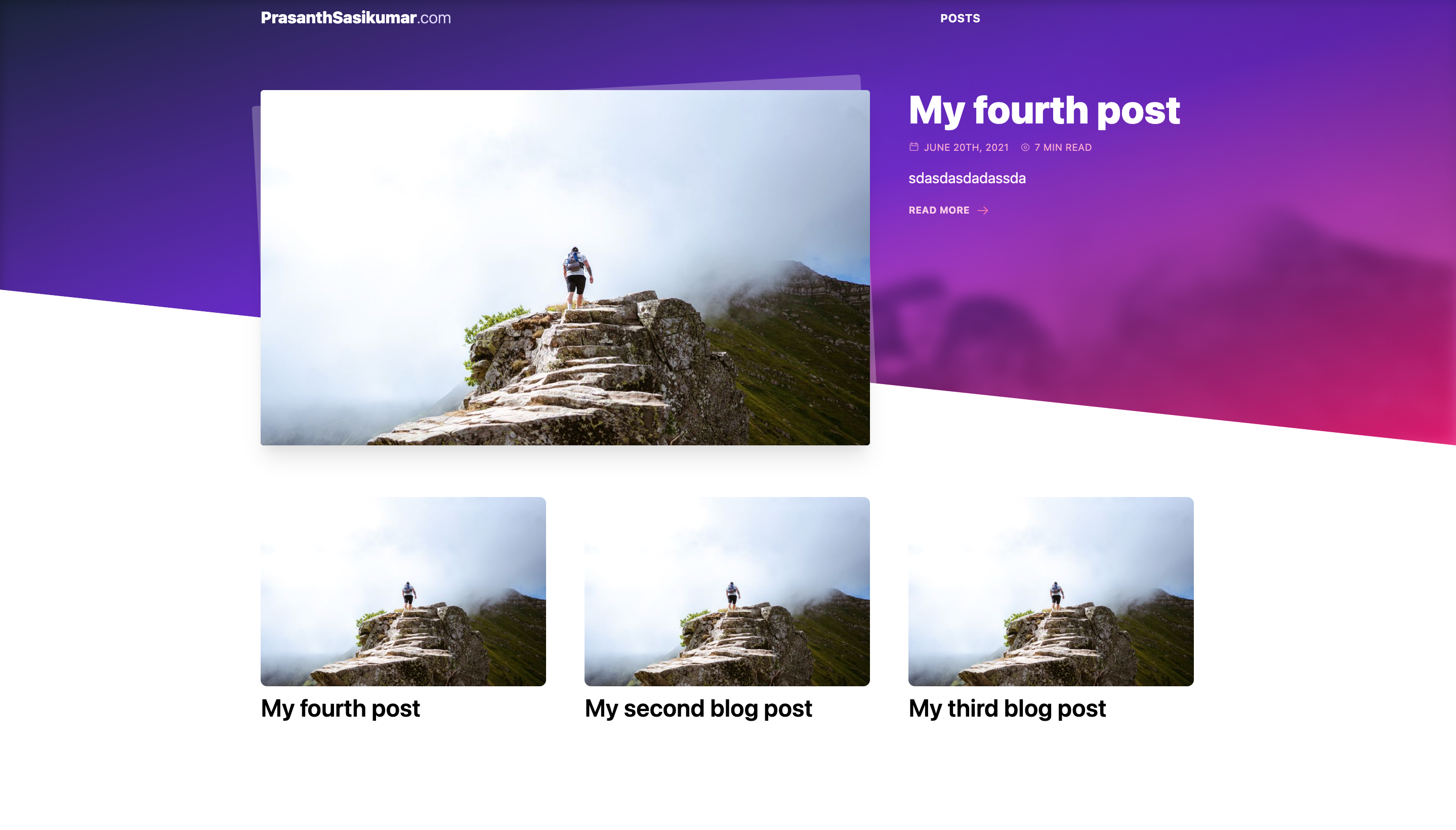
homepage_first_iteration
And then our blog posts will show their image, tags, ToC and content like so:
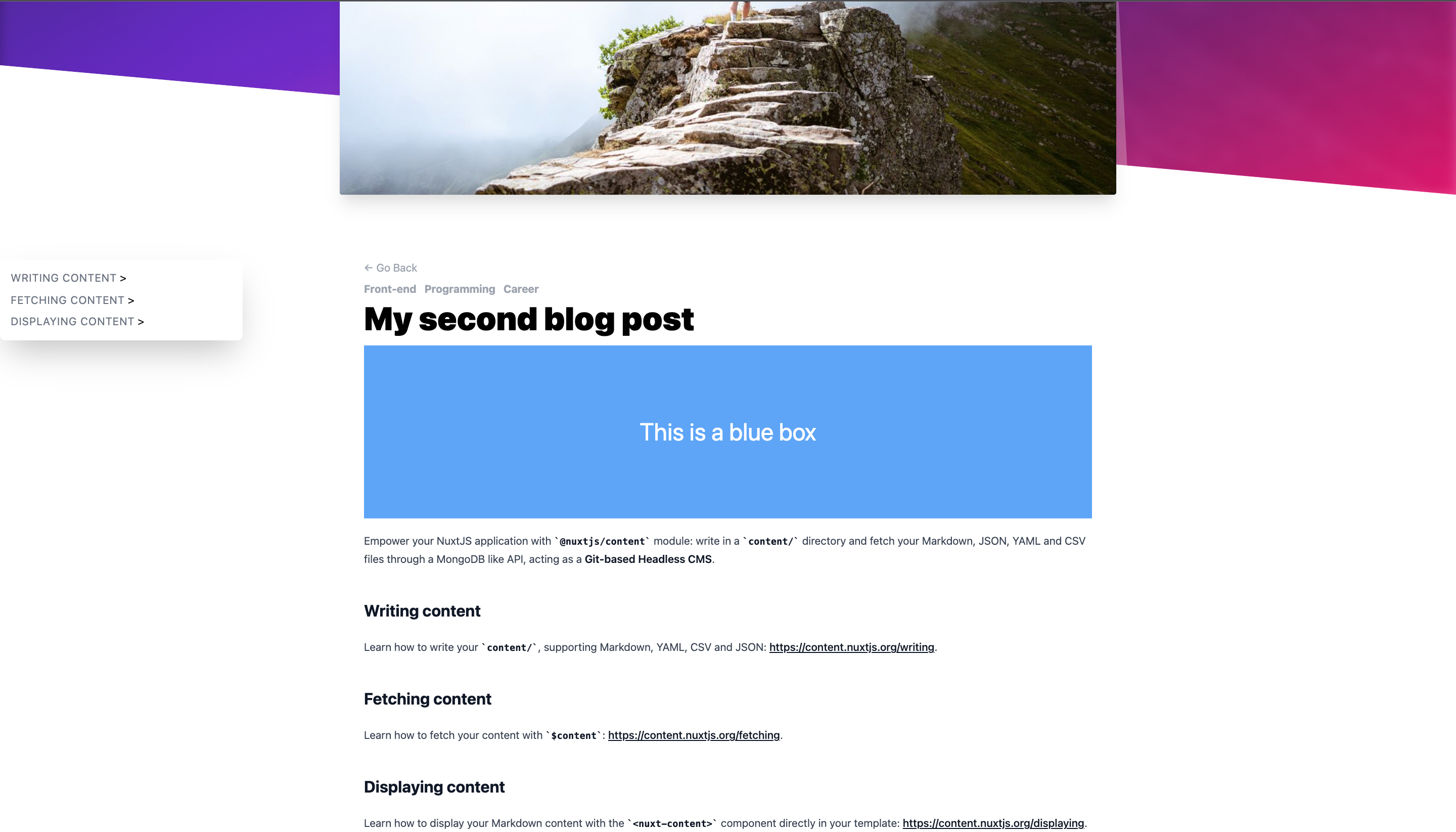
blog post
Let’s get started! Setup with create-nuxt-app To set up the project, make sure you have NodeJS installed on your machine and access to a terminal (any terminal will do). You’ll also need either Yarn or npm (comes with NodeJS)
Start by running:
npx create-nuxt-app nuxt-content-blog
This will ask you a bunch of questions to help you setup the project. Feel free to pick any options you like, but for simplicity, this is what I went with:
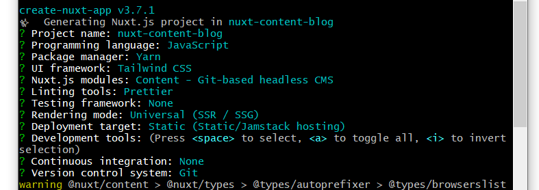
nuxt create
The key thing is that you add the “Content - Git-based headless CMS” module, which will be driving our blog. I’m gonna use Tailwind CSS as it provides awesome results and a really nice workflow. It’ll also be helpful when we get to styling our blog post content.
When it’s done, you can cd into the project. Open it with your favorite editor (I use VS Code) and run yarn dev (or npm run dev). Open your browser and head to localhost:3000 to get greeted by the Nuxt welcome screen:

nuxt welcome
I installed Vetur extension in VsCode. Just search for it in the Extensions Panel and install it, as it’ll give us a bunch of awesome features and quality of life improvements when writing Vue code.
Creating and displaying blog posts with Nuxt Content
Now we’re ready to start building! Let’s start by adding a few more posts. We’ll use frontmatter (which comes automatically with Nuxt Content) to describe some basic data about each of our posts. If you open up hello.md, the frontmatter is the information between the dashes at the top:
---
title: Getting started
description: 'Empower your NuxtJS application with @nuxt/content module: write in a content/ directory and fetch your Markdown, JSON, YAML and CSV files through a MongoDB like API, acting as a Git-based Headless CMS.'
---
We’re gonna be adding some fields to our frontmatter, so rename hello.md to first-post.md and make it look like the following:
---
title: My first blog post
image: first-post.jpg
tags:
  - Front-end
  - Programming
  - Career
---
Now, copy paste this post in the same directory to create a couple more. Update their filename, title, image path and tags to something else to make them unique:
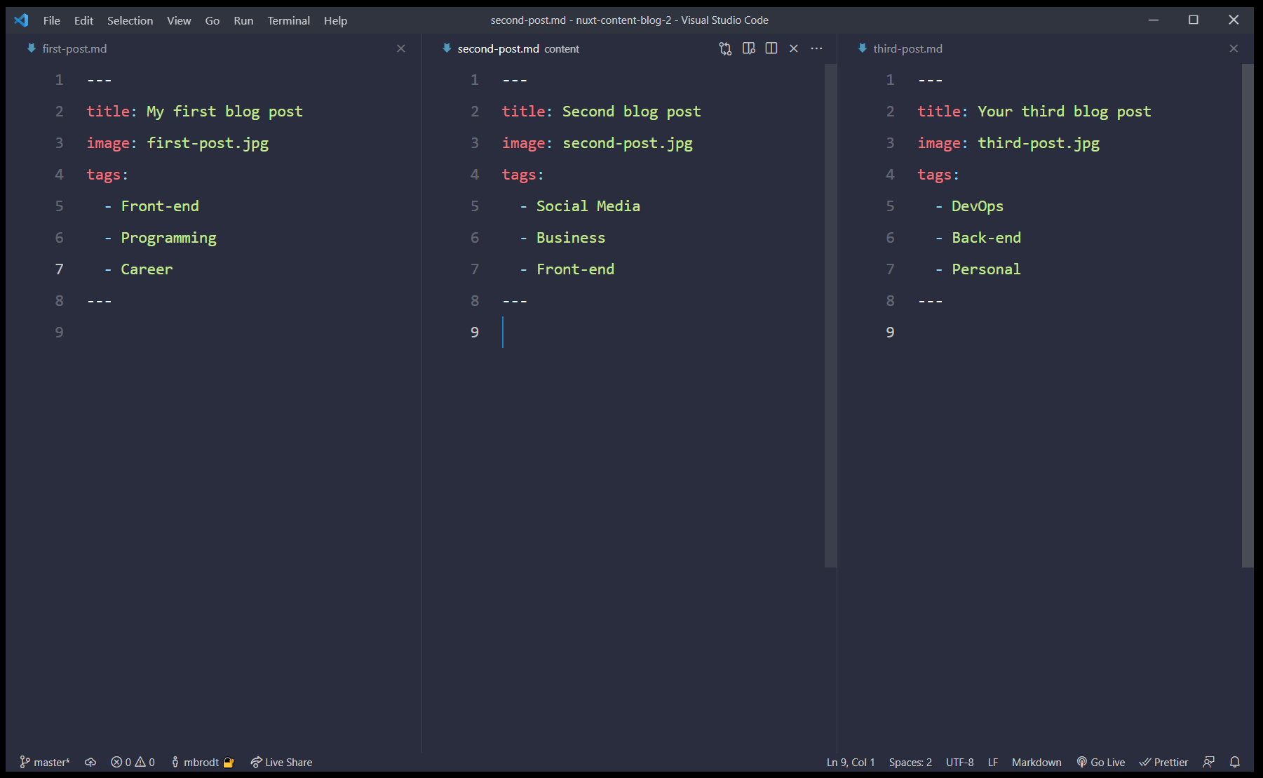
posts
The image key refers to an image path, and can be any URL on the web. In this case, I’ve added a random image from Unsplash in my static folder. This image will then be available at localhost:3000/first-post.jpg for example. Just make sure the name of the file matches the path provided exactly, and that the images are inside the static folder.
Here we’re using the $content feature from Nuxt to load in some post data (the title, image, tags and slug of each post). We then sort them in descending order (newest first), and call fetch() to execute the function. Finally we’re returning posts, which exposes the post data to our template as an array of posts. Check the console to see all the data we just grabbed:
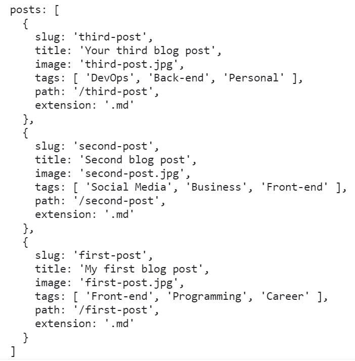
console
Let’s update our template to show the title of each post (still in index.vue):
<template>
  <div>
    <h1 class="text-7xl font-black text-center">New on the blog</h1>
    <div v-for="post in posts" :key="post.title">
      <h2 class="mt-2 text-3xl font-semibold">{{ post.title }}</h2>
    </div>
  </div>
</template>
If all went well, you should see your 3 post titles on the screen - and remember that this title is coming directly from the frontmatter of each individual post, so feel free to update the titles to something else. We’re also fetching the slug, image and tags as we’ll need those in a bit.
Creating post routes
Of course we want each post to have it’s own page to display the body content, tags, image etc. We’ll do that by creating a dynamic route in Nuxt.
Inside your pages folder, create a new folder called blog. Then, create a single file called _slug.vue inside the blog folder. This will be our dynamic route that will display an individual post. Add the following code:
<template>
  <h1>{{ post.title }}</h1>
</template>

<script>
export default {
  async asyncData({ $content, params }) {
    const post = await $content(params.slug).fetch()
    return { post }
  },
}
</script>
Now what’s going on here? Because we named the file _slug.vue and put it inside a blog folder, Nuxt will render this page component whenever it hits a URL at /blog/something. And when it does, the params object in asyncData will have access to the slug (the part of the URL after blog/, in this case “something”). We then use that slug to fetch a single post using the $content feature again. By returning post, we expose this data to the template, just like we did on the homepage when fetching all the posts.
To verify that it works, visit localhost:3000/blog/first-post and you should see the post title “My first blog post” on the screen. Because first-post is the slug, that slug gets matched up with our markdown file first-post.md.
Creating proper post previews
Now that we know our blog post routes are working, let’s go back to index.vue and make our post previews more appealing and actually link them to the individual posts. Let’s update the post loop to use a new PostPreview component that we’ll create in a second, and pass each post object to this component. We’ll also wrap the loop in a list with some grid classes to make them align nicely. With these changes, our template in index.vue should look like this:
<template>
  <div>
    <h1 class="text-7xl font-black text-center">New on the blog</h1>
    <ul class="grid grid-cols-3 gap-8 mt-8">
      <PostPreview v-for="post in posts" :key="post.slug" :post="post"></PostPreview>
    </ul>
  </div>
</template>
Let’s then create the PostPreview.vue component inside the components folder. This component will accept a post object as a prop, and then display the post image and title, and act as a link to the post itself. We’ll even use another cool new Nuxt feature to get optimized images called Nuxt Image.
Paste the following in your PostPreview.vue file:
<template>
  <li class="transition-all duration-500 ease-in-out">
    <a :href="`/blog/${post.slug}`">
      <NuxtImg
        class="rounded-lg"
        :src="post.image"
        preset="preview"
        width="400"
        height="300"
      />
      <ul v-if="post.tags" class="flex space-x-3 mt-2">
        <li class="text-gray-400 font-bold" v-for="tag in post.tags" :key="tag">
          {{ tag }}
        </li>
      </ul>
      <h2 class="mt-2 text-3xl font-semibold">{{ post.title }}</h2>
    </a>
  </li>
</template>

<script>
export default {
  props: {
    post: Object,
  }
}
</script>
Now when you look at the homepage, you’ll see the title of each post along with its tags. But now they work as links so you can click each one and go to that post’s page.
To get the images working, we’ll need to install the @nuxt/image module. Do that by running:
yarn add @nuxt/image
Then, head into your nuxt.config.js and add it to your buildModules array (alongside the Tailwind module that was automatically installed in setup):
buildModules: [
    '@nuxtjs/tailwindcss',
    '@nuxt/image'
],
Finally, add the following to nuxt.config.js as well. This will tell @nuxt/image to optimize for different screen sizes and add a preset we’ll use in our PostPreview:
image: {
screens: {
  xs: 320,
  sm: 640,
  md: 768,
  lg: 1024,
  xl: 1280,
  xxl: 1536,
  '2xl': 1536,
},
presets: {
  preview: {
    modifiers: {
      fit: 'cover',
      format: 'jpg',
      width: 400,
      height: 300,
    },
  },
},
}
Reload the homepage, and you should now see our images show up:

Adding a layout
Great! But the page itself could use some max width to make it look better. There’s many ways we could do this, but let’s use another Nuxt feature: Layouts.
Create a new folder in the root of your project called layouts. Inside that, create a file called default.vue and paste the following in there:
<template>
  <div class="min-h-screen w-screen pt-24">
    <div class="max-w-7xl mx-auto">
      <Nuxt />
    </div>
  </div>
</template>

<script>
export default {}
</script>
Displaying post content
Now that we got a nice looking homepage, let’s move on to the actual blog posts in our _slug.vue file. There’s gonna be a lot going on here, so start by setting your template up like this, and we’ll break it down bit by bit:
<template>
  <article class="grid grid-cols-12 pb-24">
    <NuxtImg
      class="rounded-lg col-start-3 col-span-8 w-full"
      :src="post.image"
      width="768"
      height="509"
    />

    <div class="w-full col-start-1 col-span-12 grid grid-cols-12">
      <nav class="mt-8 col-span-2 shadow-2xl rounded-lg p-4 self-start">
        <ul class="space-y-2">
          <li v-for="link of post.toc" :key="link.id">
            <NuxtLink
              class="uppercase tracking-wider text-gray-500 hover:underline"
              :to="`#${link.id}`"
              >{{ link.text }}</NuxtLink>
            >
          </li>
        </ul>
      </nav>
      <div class="col-start-4 col-span-6 w-full">
        <div>
          <NuxtLink to="/" class="block text-gray-400 mt-8">← Go Back</NuxtLink>
          <ul v-if="post.tags" class="flex space-x-3 mt-2">
            <li
              class="text-gray-400 font-bold"
              v-for="tag in post.tags"
              :key="tag"
            >
              {{ tag }}
            </li>
          </ul>
          <h1 class="text-5xl font-black mt-2">{{ post.title }}</h1>
        </div>
        <nuxt-content class="mt-4 prose max-w-none" :document="post" />
      </div>
    </div>
  </article>
</template>
Firstly, we’re including the post image on top of the page to catch the attention of our reader. Then we add a Table of Content using a special key on our post object that Nuxt Content has added for us called toc. This key is an array with ID’s of every headline that’s part of the body content. We use this to add
<nav class="mt-8 col-span-2 shadow-2xl rounded-lg p-4 self-start">
  <ul class="space-y-2">
    <li v-for="link of post.toc" :key="link.id">
      <NuxtLink
        class="uppercase tracking-wider text-gray-500 hover:underline"
        :to="`#${link.id}`"
        >{{ link.text }}
      </NuxtLink>
    </li>
  </ul>
</nav>
Next up, we have some code to display a link back to the homepage, the tags of the post, and the title:
<div>
  <NuxtLink to="/" class="block text-gray-400 mt-8">← Go Back</NuxtLink>
  <ul v-if="post.tags" class="flex space-x-3 mt-2">
    <li
      class="text-gray-400 font-bold"
      v-for="tag in post.tags"
      :key="tag"
    >
      {{ tag }}
    </li>
  </ul>
  <h1 class="text-5xl font-black mt-2">{{ post.title }}</h1>
</div>
And finally, a single (but very important!) line of code:
<nuxt-content class="mt-4 prose max-w-none" :document="post" />
This is where we tell Nuxt Content that we want to render the entire body of each blog post. We can install a plugin to provide better typography defaults. Run:
yarn add @tailwindcss/typography
To use this plugin, create a tailwind.config.js file in the root of your project and add the following:
module.exports = {
  purge: [
    './components/**/*.{vue,js}',
    './layouts/**/*.vue',
    './pages/**/*.vue',
    './plugins/**/*.{js,ts}',
    './nuxt.config.{js,ts}',
  ],
  darkMode: false, // or 'media' or 'class'
  theme: {
    extend: {},
  },
  variants: {
    extend: {},
  },
  plugins: [require('@tailwindcss/typography')],
}
All this code is Tailwind specific, so don’t mind if it doesn’t make sense to you. But the key is in the plugins array, where we require our newly installed typography plugin. Restart your dev server and head back to the blog post - you should see the content looking MUCH better with great typographic defaults 🔥
Website: Generating RSS feed
